Nikkei Asia
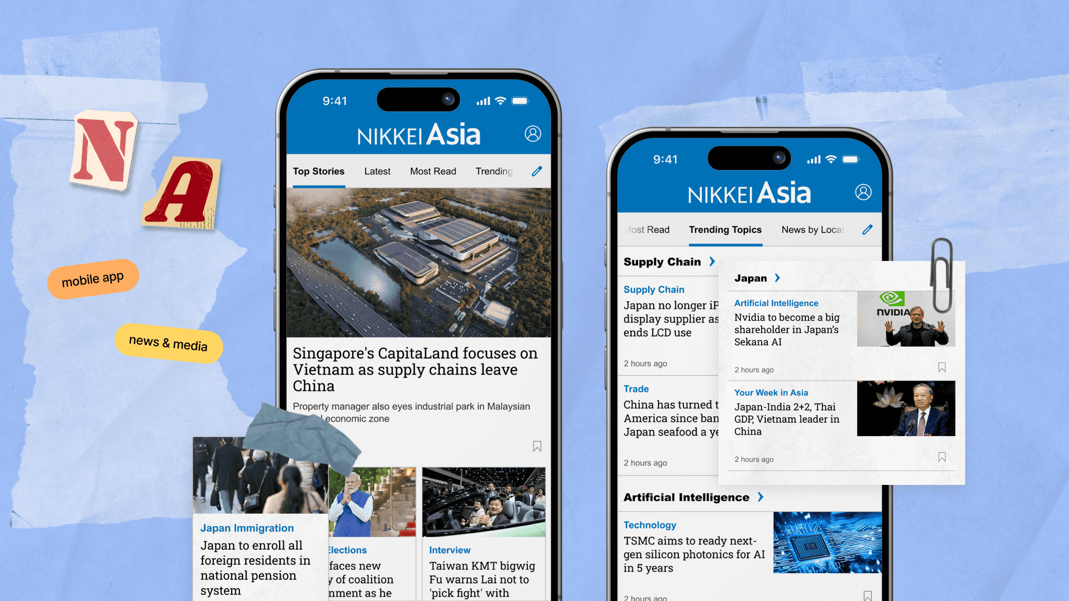
Enhancing the mobile app experience to focus on boosting engagement and retention for readers.
Overview
Nikkei Asia is a leading English-language news publication that focuses on delivering in-depth coverage of economic, political, and social developments across Asia.
With a particular focus on key markets like Japan, China, India, and Southeast Asia, the publication caters to a global audience interested in understanding Asia's role in the global economy. Nikkei Asia is available in both digital and print formats, though it primarily operates as a digital-first platform to cater to the modern, on-the-go reader.
Role
UI/UX Designer — User Research, User Testing, Prototyping, Visual Design, App Design.
Date
September 2024
Project Background
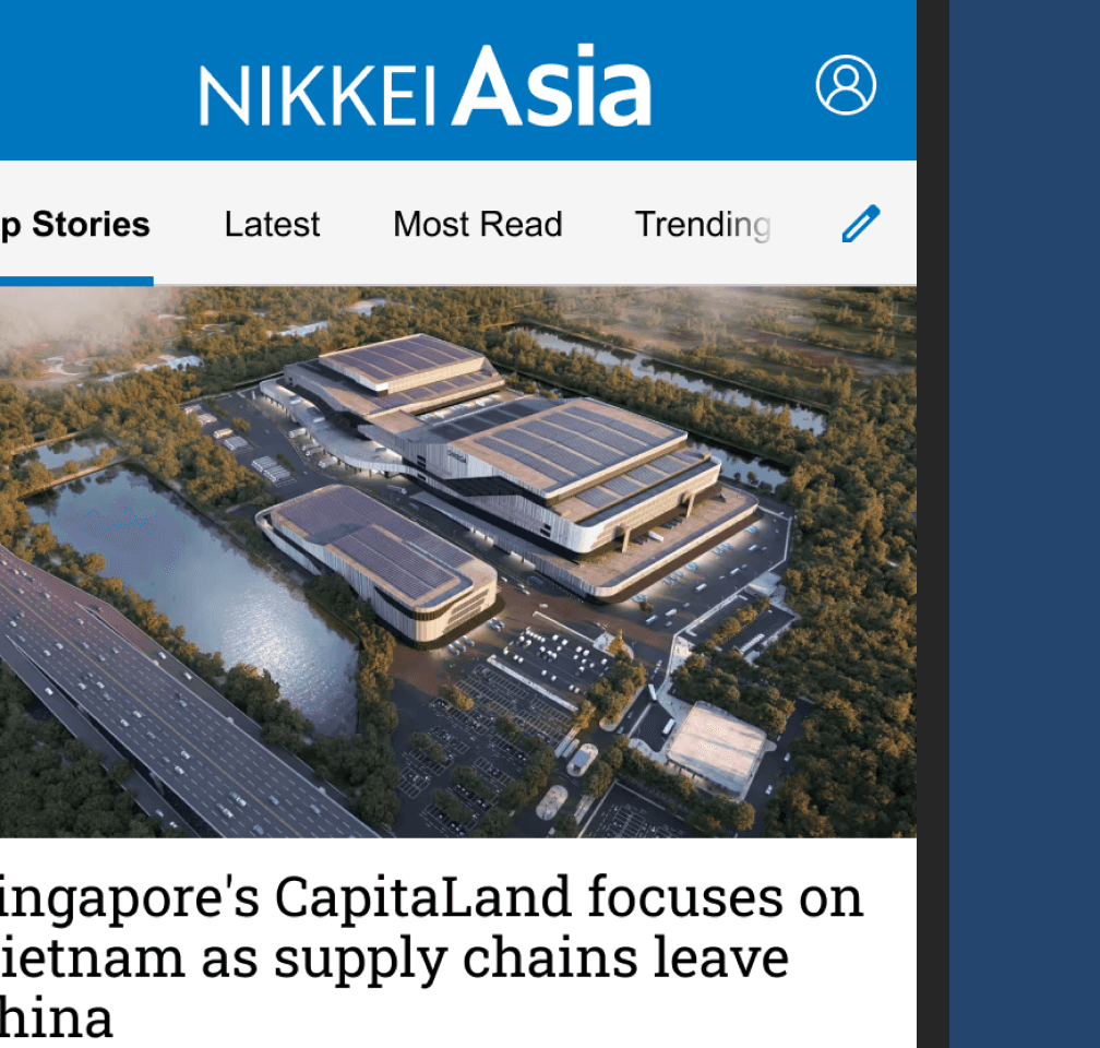
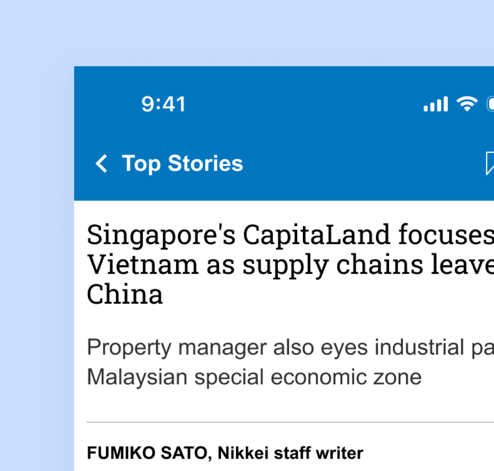
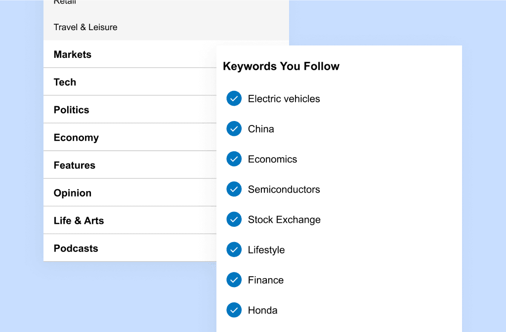
The Nikkei Asia mobile app provides users with streamlined access to news focused on business, economics, and political developments across Asia. Its clean, minimalist design emphasises functionality, offering features like real-time news updates, topic-based customisation, and in-depth articles. However, some users may find the navigation slightly limited in personalisation options compared to other news apps, and there could be improvements in user engagement through more interactive or dynamic features
The target areas for this phase of the redesign consisted of the following features:
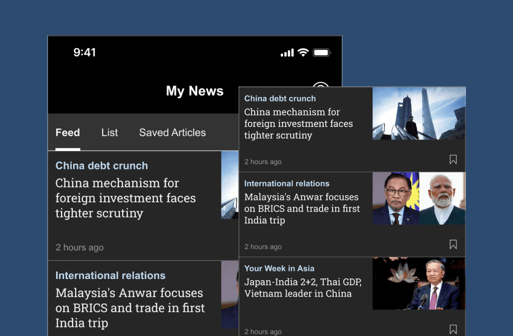
• Introducing the “My News” feature into the mobile app
• Revamping the flow for “Edit Timeline”
• Better access to “Saved Articles” collection
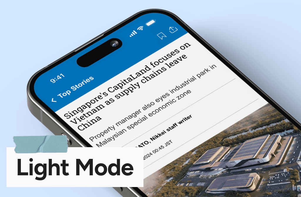
• Improving the usability of the “Font change” feature
• Further visual improvements for the paywall design to encourage better user subscription rates
Target Audience
• Existing paid members: The app primarily serves users who are already paid members on the web, offering a more convenient and tailored experience. Although free users can still access the app, but is only limited to one article per day.
• Preference for app usage: Improving the app experience also caters to users who prefer consuming content via the app rather than a mobile browser.
• Those who primarily use their smartphones are likely to prefer the app over the browser, benefiting from features like push notifications, font size customisation, and dark mode.
Pain Points
Understanding user pain points is essential to crafting effective design solutions.
Scattered Navigation
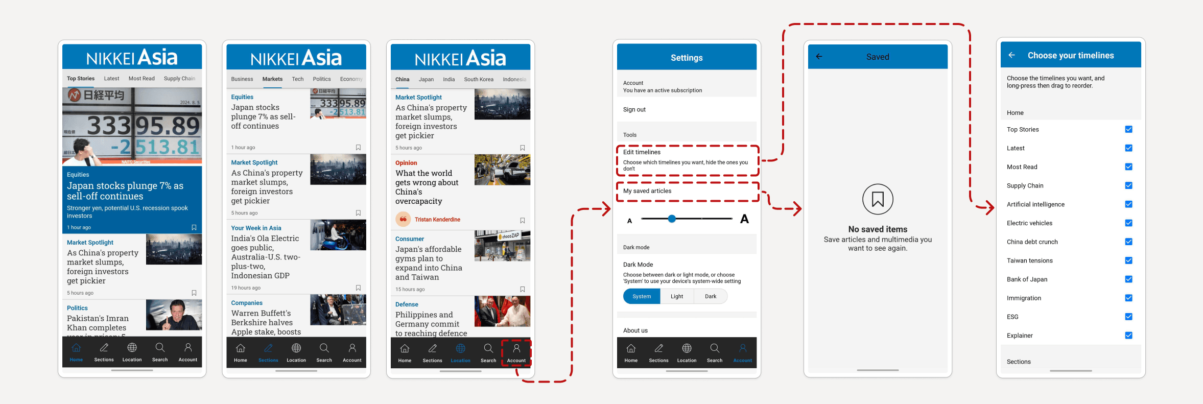
There is not a consolidated area where users can browse for topics, instead they are split into the following tabs: Home, Sections, Locations, Search.
Page Structure
Upon introducing the My News feature on the app, there needs to be a rethink on whether using up four tabs might be unnecessary.
Hidden Features
Some users have raised concerns that the placement of “Edit Timeline” feature and “Saved Articles” is too hidden.
Feedback Delay
Currently, when user attempts to change the font size, they are not getting direct feedback of the font changing. They are required to go back and open a new article to see the change.
Competitive Analysis
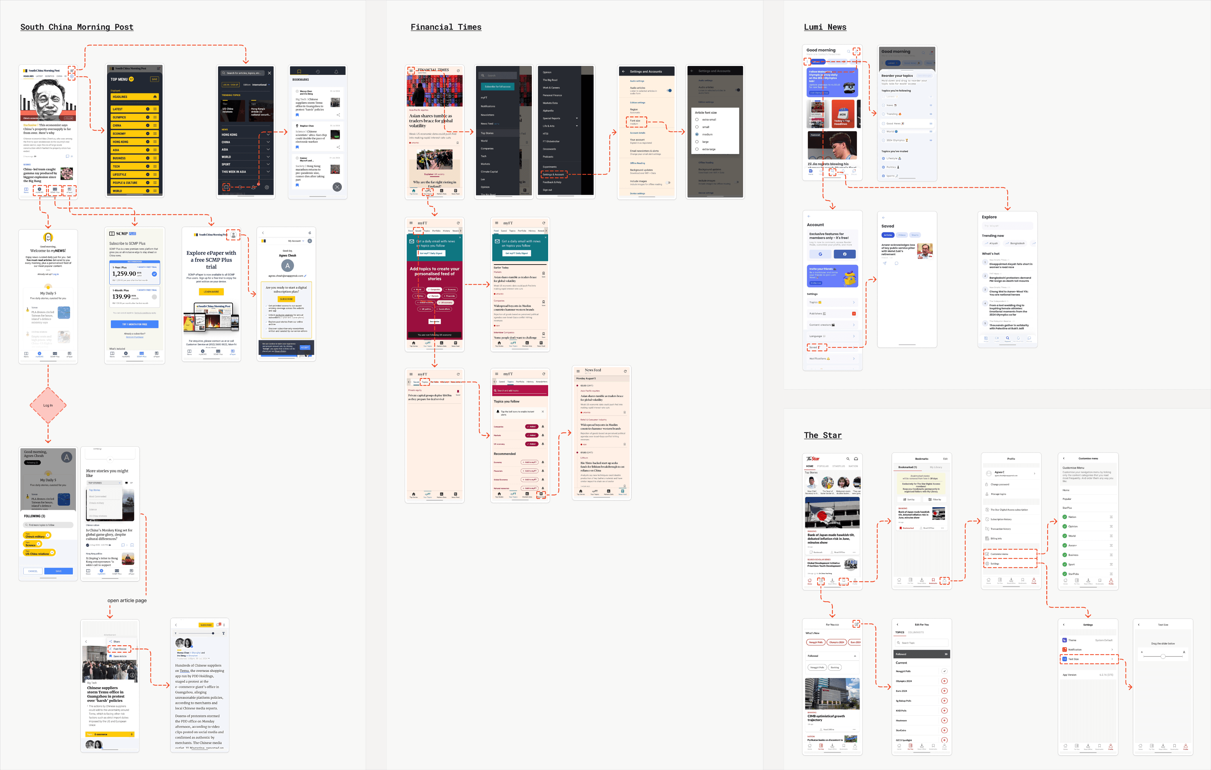
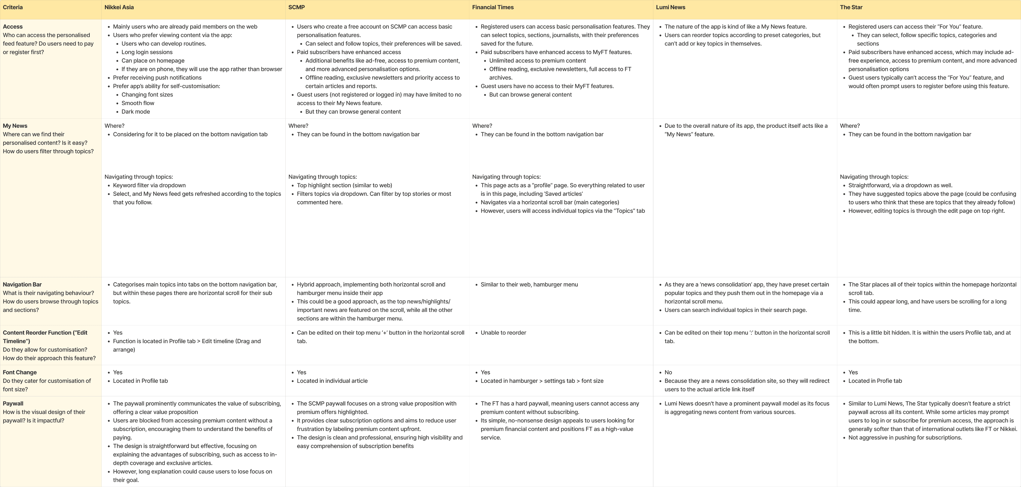
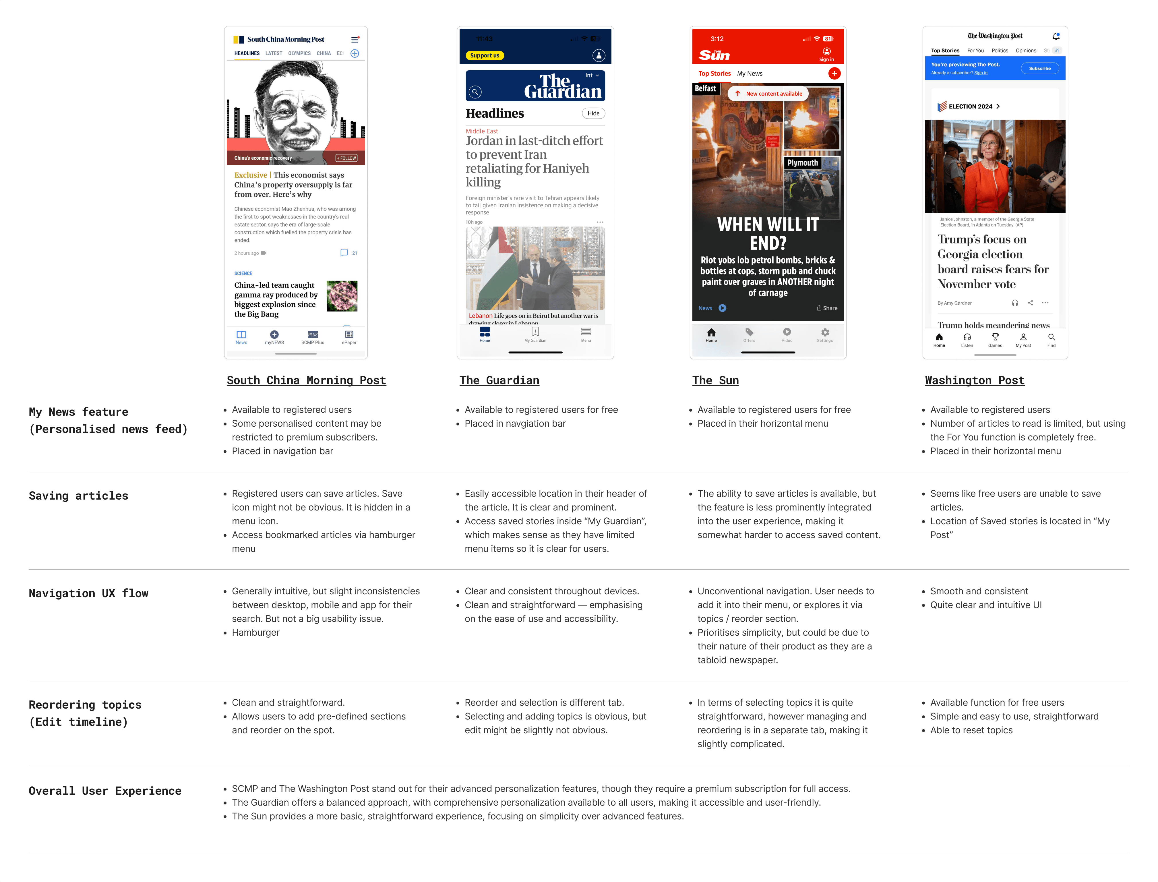
In the initial research stages, I have conducted a thorough competitive analysis to evaluate industry trends and user preferences, identifying key opportunities to enhance design solutions. By exploring potential approaches and aligning them with user needs, I was able to inform my design choices, ensuring they were both innovative and strategically positioned for success.
Opportunities & Potential Approaches
Comparison Chart & Summary
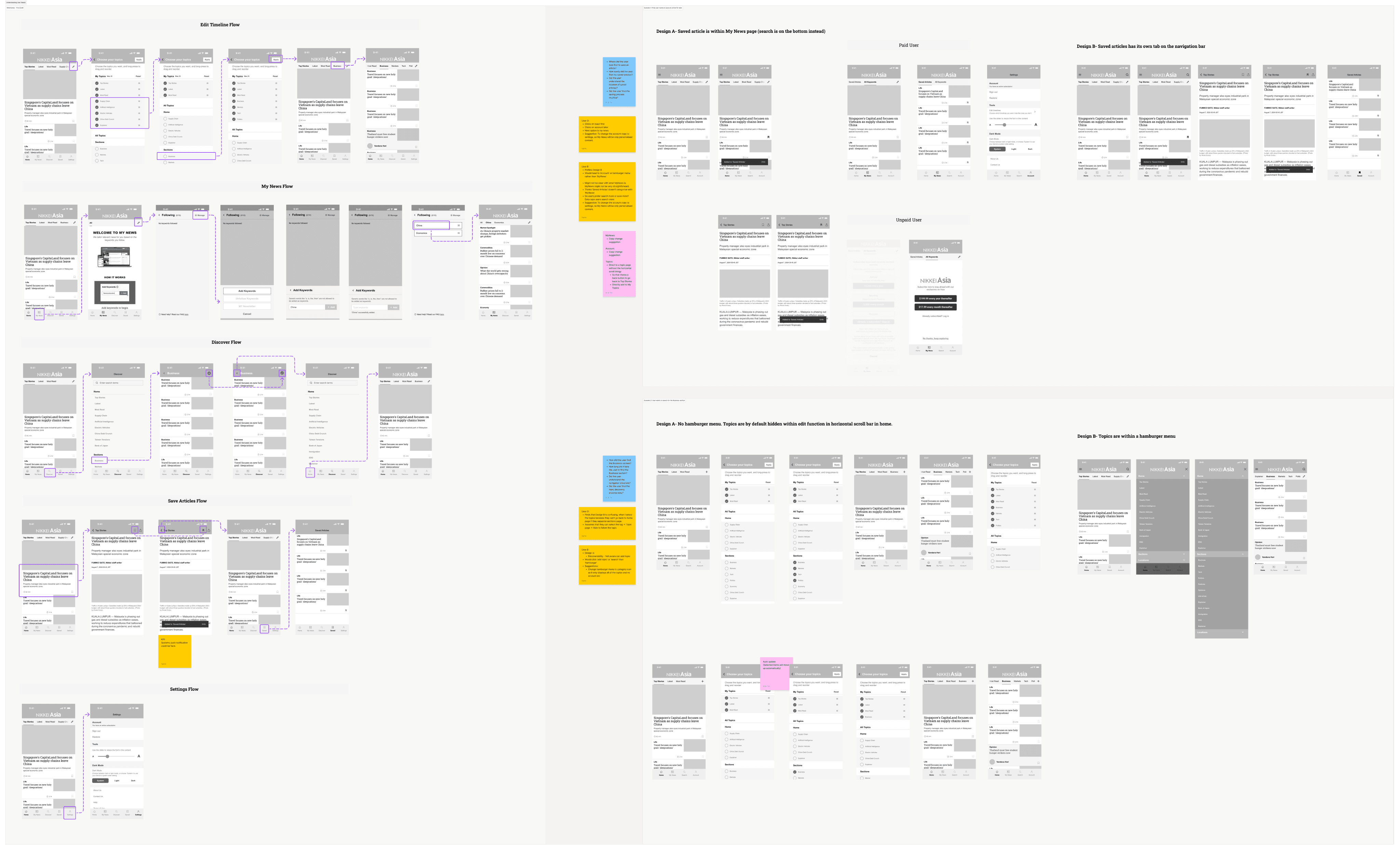
Testing & Reiteration (Wireframes)
Understanding User Needs
Insights gained from early research and user feedback
We had a few key findings that influenced our design decisions such as our placement of the My News tab as well as accessing the saved articles feature.
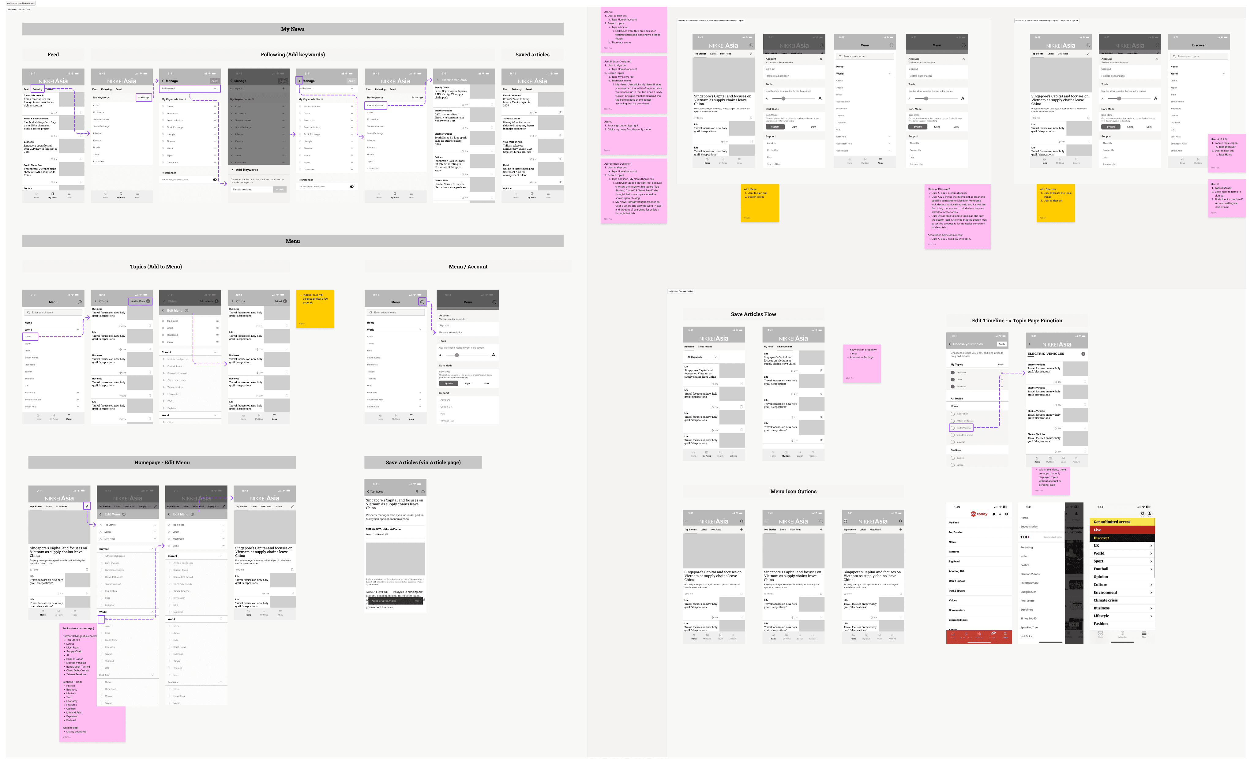
In our first few stages of iterating wireframes, we went through some rounds of user testing to find the most valuable insights from users. We’ve applied task-based testing where we created specific tasks for users to complete, analysing their flow through the design to uncover areas of confusion and simplifying interactions based on their experience.
Hence, in our first version of wireframes, we were proposing to:
• Place navigation menu topics into one tab and combine with its search feature, so users go to one dedicated page specifically for browsing topics.
• Splitting “Saved Articles” feature away from My News and have its own dedicate page for it.
Anticipating Usability Challenges
We preemptively solved navigation and interaction problems by leveraging user feedback to guide our design improvements
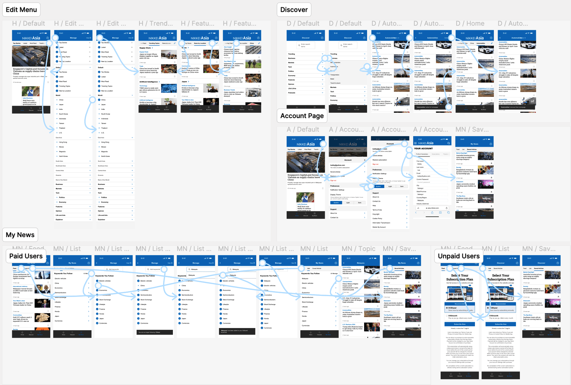
As we got the ball rolling from the initial stages of wireframe and user testing, we proceeded to conduct multiple rounds of A/B user testing, gathering feedback and refining the design to ensure intuitive and smooth interactions for all user types.
One of the `major takeaways from iterating was the need to simplify navigation and refine key touch points to minimise user friction. Through iterative adjustments, we were able to enhance clarity, improve functionality, and ensure a more intuitive user flow, resulting in a design that better aligned with user expectations and needs.
Final Implementation & Proposed UI Design
How key takeaways and opportunities shaped the final design and its impact
The final proposed designs are the result of an iterative process grounded in user testing, competitive analysis, and continuous refinement. By incorporating user feedback and addressing key pain points, I streamlined the design to prioritise ease of use and a seamless user experience. Each iteration brought the design closer to meeting user expectations, balancing functionality with aesthetic appeal. The result is a thoughtful and intuitive design that aligns with both user needs and business goals.
Project Retrospective
Redesigning the Nikkei Asia mobile app was a critical step toward enhancing usability and engagement for its diverse audience. Through the redesign process, we addressed key pain points such as fragmented topic navigation, the need for a more streamlined tab structure, and improving the discoverability of essential features. By focusing on user feedback and refining the app’s core interactions, the final design not only improved the overall user experience but also created a more intuitive platform for accessing personalized content. The changes implemented are set to drive better engagement and long-term retention, positioning the app to meet evolving user needs more effectively.
Key Takeaways
Deep exploration: Reflecting on this project, the journey from initial research to final design was marked by deep exploration, continuous iteration, and thoughtful refinement. Early stages were focused on understanding the competitive landscape and identifying user pain points, which became key drivers in shaping design decisions.
User testing insights: User testing provided invaluable insights, helping to surface challenges that weren’t initially apparent and guiding us toward more intuitive solutions.
Dynamic iteration: The iterative design process allowed for a dynamic approach where feedback was constantly integrated, ensuring that every design choice was purposeful and aligned with user needs.
Opportunities for innovation emerged through this feedback loop, inspiring creative approaches to solve complex problems, particularly in terms of navigation, interaction, and overall usability.
Purposeful design: Every design choice was intentional, aligning with user needs and project goals.


